|
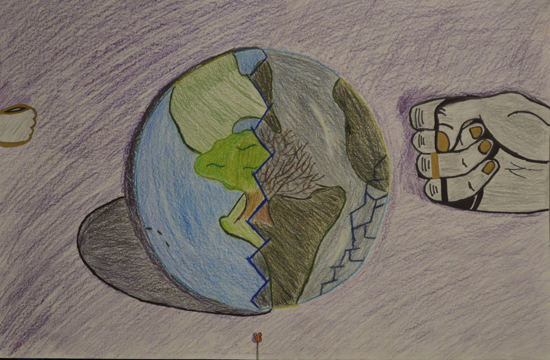
Exitio Terra (Destroying Earth)
Medium: Drawing
Year: Semester one 2019 Art Studio
Artist Statement:
The meaning behind my artwork is to express what we should know about what we are doing to the earth year by year. Since our human hands is what keeps exploring and inventing new stuff it is what the hand represents humanity. The smaller the hand the smaller impact it has on earth.The bigger like the right symbolizes stronger more impact humanity has on earth.
The golden color on the fingers and hands symbolize the good people trying to do good to earth and try to help keep earth natural. The black on the hands symbolizes the bad not-caring people taking over earth and them not caring how they will impact earth. Since there are shadows around the hands in between the fingers that symbolizes bad people acting like good people. The bigger hand is also ugly looking because it symbolizes what is going to impact earth will leave earth dead with no life to support us.
The bright colorful half of earth is the past of the earth. It was once all healthy with clean fresh air. The water was clean and crystal clear. The continents we green and colorful. The tree represents wildlife, which includes animals and plants and all living organisms. It was healthy too, with a bunch of wildlife roaming. Not even close to extinction. They would roam free not fearing anything but nature and the predators. Then we came along. That is what the small cracks or lines that are at bottom left of the earth symbolizes.
As you go to the future or the bottom right of the earth the cracks get bigger and deeper than before. The right side of the earth is dark and ugly. The continents are brown and mucky looking. The tree has no leaves and it looks dead. That symbolizes wildlife dying and going into extinction. The earth will be lifeless soon if we keep going on the path we are traveling on.
The shadow cast on the left side of the earth are the extinct animals. They are gone. The small flower at the bottom of my artwork represents the very few animals on the edge of extinction.
My inspiration was this one meme picture I saw on snapchat that Jho put on her story. It said something like “ Imagine if trees gave off free wifi. Then we would plant a bunch of them and probably save the earth. To bad they only give off oxygen to help us breath.” And that is where it all started.
I chose to create this because I feel like people don't really know what their impact on earth truly is. I feel like they need more awareness of earth and what it will soon be like if we keep destroying the earth. Hence the name of the artwork, Destroying Earth.
I used the drawing a blending colors technique because this was a new technique I could use and explore on. I could also improve with some practice.
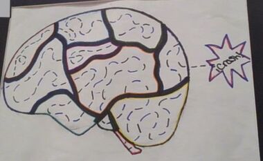
Cerebrum Divisi: (Mapped Brain)
Medium: Drawing
Year: Semester one 2019 Art Studio
Artist Statement:
The meaning behind my artwork is all the things mental state of a teenage mind. Each color represents a different feeling, emotion, object, it could be anything. Each subject has a space in the brain. Since we value each object differently, I made some spaces in the brain bigger and others smaller. I didn’t label them because not all of our minds are going to like the same things.
My inspiration was my emotions of my crush like what I felt for him and how he felt towards me. Also another inspiration, which is where I originally got the idea from, is a movie I was watching with my dad. The movie was The Island starring Scarlett Johansson,one of my favorite actors. It was about how some guy was making money by creating clones of famous rich people. And they supposedly don't have any feelings but one of them was above what he was supposed to be. That is where I got my inspiration.
I chose to create this because there are a lot of teenagers . I made it so they could identify with what matters most to them and to compare something that should and shouldn't be in their mind at this time of their life. This also represents me because of everything that has been going on lately. I used the drawing and coloring technique because I want to improve my skills in this area.
|
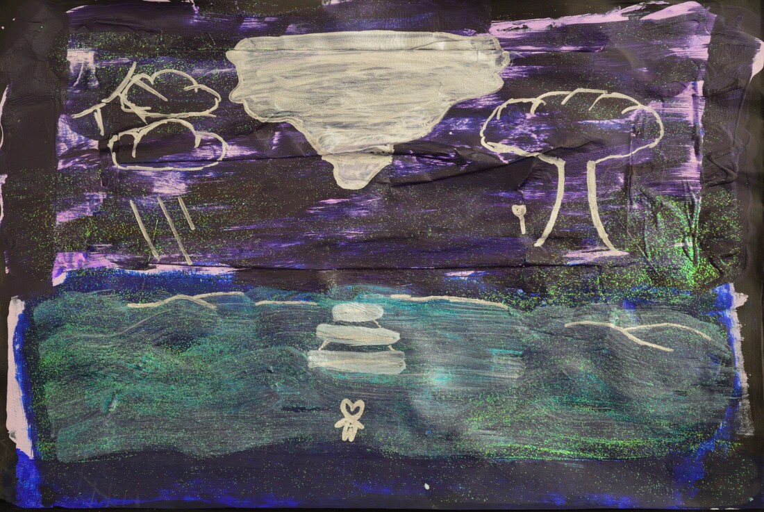
Natura Perfide (Nature Untrue)
Medium: Mix Media
Year: Semester one 2019 Art Studio
Artist Statement:
The meaning behind my artwork is well most of it was lost in the process of making it. Originally it was to express my feelings towards my favorite singer. But then I had to have some sort of layering embedded into it. Now it's meaning is that even though days may look all stormy, a certain someone can make the sun shine brighter than before. It also symbolizes that nature will overcome the storm that will hit it soon.
My inspiration was my favorite singer, V. This was also inspired by the poem we did in English. It was about our favorite person and be an extended metaphor. https://docs.google.com/document/d/1RgjzynEYhPoty3ASCbClA_RND5Bg-DuaIzHUqFtQTBc/edit
I chose to create this because I wanted to make something that would express what I feel about him.
I used the mix media technique (which includes drawing, painting, paper mache, jelly printing, glitter paint and painting) because we needed to use layering. I also felt like these materials would be cool to experience with and get better at using.
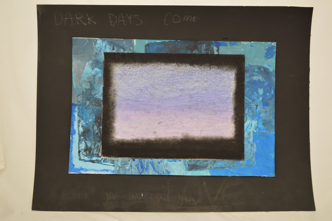
Fake Love
Medium: Mixed Media
Year: Semester two 2020 Art Studio
Artist Statement:
The meaning behind my artwork is that even though you are suffering people might not understand and block you out. They might put a boundary to stop the bad vibe to affect them even though they might be the cause of the sad vibe or sad feelings. The barrier symbolizes the boundary and different bluer color is the fake love. The purple is the sad but true love.
My inspiration was the song Fake Love by BTS and my feelings of sadness during that time. It helped me think of how others feel after being treated differently, badly or mistaken.
I chose to create this because i wanted to express what i was feeling during that time and how others would feel when they went into a situation like mine.
I used the mix media technique. This would include painting, paper, jelly printing, chalk and sharpies. I used this because i wanted to use colorful materials and something with the look of texture but not really.
